Blog.
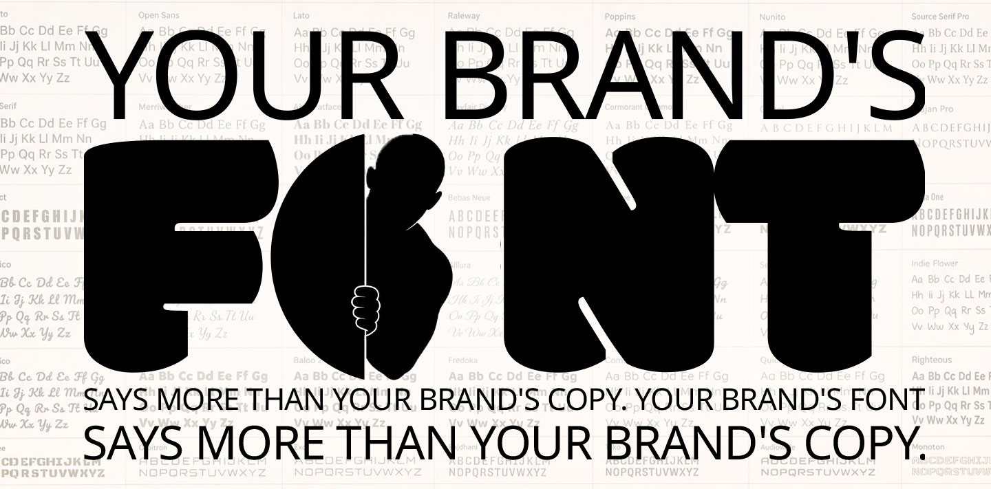
Typography is the first impression your brand makes to the world.
In 2009, IKEA tried something new and revamped all the fonts in its catalogues and store signs. Futura, their norm, a clean and geometric typeface, was removed, and Verdana, an easily readable typeface, was introduced. It was a change that fell on blind customers' eyes, but designers and insiders noticed the change instantly. The backlash from the design community turned into a PR nightmare for IKEA, a brand synonymous with its classic Scandinavian reputation.
The products were unchanged, as was the catalogue copy, but a brand famous for its thoughtful design went generic; the problem was the letters themselves.
Type Gets Read Before Words Do
A person notices a font before they register a single word; whether it pleases the eye or the brand comes off as premium, serious, playful, or inviting is almost instantaneous. The sentence is left uncomprehended because a particular itch wasn’t scratched.
So even if a luxury hotel brochure talks about marble floors, concierge service, and custom spa days, a rounded, casual typeface still feels off. The font sets a precedent for the kind of experience the customer is about to receive; it is the first impression for a reader, and with the amount of options available in the market, an unpleasing first impression is usually trusted.
When a person finishes reading a tag or headline, the typeface is the medium through which they decide how they should feel about the copy, the product, and the brand.
When the Type Contradicts the Voice
Zomato’s brand voice across every multimedia channel pushes a witty, irreverent, silly, and chaotic theme, which makes the copy feel like friendly banter. If that tone were read in a very formal serif font typically used in legal documents, the joke might never land. While it takes a lot to seem organically witty, the fact that Zomato’s copy is so memorable is in part due to its informal lettering.
A brand like LIC has built trust over decades of consistent work. A sudden switch-up to a loose, hand-drawn script could shake the brand’s core trust, even if the copy is perfectly written. The font and the message need to be aligned, or readers end up trusting whichever meets their eyes first.
Why Type Gets Deprioritised
Most brands treat typography as a one-time thing, created early in a project, then saved in brand guidelines and never revisited. Unlike brand voice or tone guidelines, which are constantly updated and seen as ever-evolving with the brand’s growth. When a brand revamps its tone of voice, the font doesn’t get the same update, even though it shapes consumer opinion every time it is seen.
This is extremely prevalent in India; many brands see their English typeface as their true identity, but their Devanagari, Tamil, or Bengali fonts are only matched by size, not style. A warm and contemporary English font can look extremely rigid and vapid in a regional script if the same attention hasn’t been given to it.
A Practical Way to Think About It
Brand typography and voice must be organically aligned; they shouldn't exist in a vacuum as a design task to be tackled. Before a new headline font is approved, ask yourself and your team the same questions you would ask during a copy review: “Does this sound like us?”
If a line is checked under the “on voice” lens, the same examination must be done for the letters portraying the message. One is an informed, calculated decision, and the other can happen in a split second.
Final Word
In every brand review meeting, people talk about words exponentially. The typeface that carries that message should get the same time, care and attention. Next time, before you spend hours discussing what to say, account for what the words are already saying.
Tags:
Blogs
More Stories
In India’s dynamic business landscape, a brand is far more than its logo, tagline, or colour palette. It’s the sum of promises kept, experiences delivered, and trust earned over time. Whether it’s a Bengaluru fintech startup or a century-old textile house in Surat, brands that thrive are those that go deeper than design — they live in the minds and hearts of their customers.
 Amit Bailke
In today’s noisy marketplace, your brand isn’t just competing with other businesses – it’s competing with every post, ad, and notification that distracts your audience. That’s why the advertising agency you choose can be the single most important decision for your marketing success.
Amit Bailke
Many marketing projects derail not because the agency lacks talent, but because the client didn’t clearly define what they needed in the first place. Think about it — if your team and your agency aren’t aligned on the starting point, the goal, and the parameters, you’ll waste time, burn budget, and risk getting work that doesn’t hit the mark.
Amit Bailke
We’ve all wondered at some point — does branding really make that much of a difference? A common myth is that branding is only for big companies with deep pockets. In reality, it’s not rocket science. When brands make informed, consistent decisions, consumers feel more confident engaging with them
Amit Bailke
We’ve all wondered at some point — does branding really make that much of a difference? A common myth is that branding iHumour has always held a special place in Indian marketing. From Amul’s iconic topical billboards to Fevicol’s legendary one-liners, humour has shaped the way brands win hearts in this country. Humour isn’t just a creative choice—it has become a strategic tool for brands looking to cut through overwhelming digital noise.
Amit Bailke
Celebrity endorsements are common Indian advertising. In a country where film stars, cricketers and digital influencers enjoy massive admiration, linking a brand with a famous personality can instantly drive visibility, trust and desirability. Although, it must be executed carefully, so that it enables brands to leverage fan communities and create emotional connections that conventional advertising struggles to achieve.
Amit Bailke
The desire to distinguish yourself in a sea of similar brands through bold, disruptive work has become a blanket claim, since only a few actually do so. Most of the envelope-pushing work agencies develop never reaches the client — it dies a silent death within the agency, in a cycle fed by both sides. The lack of courage lies with neither the client nor the agency, but with both.
 Mihir Modak
A new client has been onboarded and says, “Surprise us. No idea is a bad idea.” At first glance, this is the dream brief: no red tape, no strict obligations, pure creative freedom. But “Surprise me” is an incomplete instruction packaged as a complete one, and it ends up wasting exactly what it was meant to save: time.
Mihir Modak
It takes a lot of effort to make things seem effortless. “Daag Acche Hain” doesn’t sound like a typical tagline — it sounds like an actual conversation, and that is exactly why it works so well. The best taglines don’t sound baked in a creative agency, but that ease comes with hard work.
Mihir Modak
The 30-second ad was the standard for advertising for as long as anyone can remember. Budgets, briefs, and strategies were designed around it. Today, attention is split between reels, shorts and stories, and most ads get their verdict within the first two or three seconds.
Mihir Modak
In 2009, IKEA swapped Futura for Verdana. The products and the copy were unchanged, but a brand famous for thoughtful design suddenly felt generic. Typography is the first impression your brand makes, and it gets read before a single word does.
Mihir Modak
“Dumb Ways to Die” broke records at Cannes Lions, yet the rail network saw only a small drop in near-misses. Clients and juries keep different scoreboards, and trouble starts when it is unclear which one a campaign was meant to win.
Mihir Modak
Open any e-shopping platform and the customer reviews describe the product better than the brand copy ever did. The three- and four-star reviews are where people explain themselves, in exactly the friend-to-friend register a good ad is trying to reach.
Mihir Modak